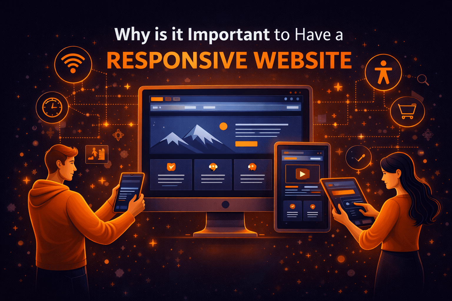
The number of devices purchased such as smartphones and tablets are constantly increasing. Obviously, when the device’s numbers are increasing, the usage is also growing parallel. Therefore, your business website must be responsive so that the clients can easily browse and find out the information regardless of their mobile device. Below we have outlined the top reasons why it is important to have a responsive website!
The number of devices is increasing.
According to recent surveys, approx 50% of adults own a smartphone, and almost 60% of all website traffic is from a smartphone. The fun fact is that there are more mobile devices on the earth than people. Everyday mobile uses are constantly growing, so every day, more and more critical it from a customer perspective will be your website for mobile devices. If the customer experience of viewing your website is poor, they will likely revisit your website and prefer to visit your competitor’s website.
Ecommerce Steadily Growing
In the past, the concept of online shopping was just a joke. But things are different now. Online shopping is a lot easier than waiting in the car driving to the store. You can even do online shopping from your favorite chair while watching TV. Approximately 85% of consumers regularly used their smartphones for online shopping. Almost every shopper has a smartphone while in the stores during the holidays. If your online store is not user-friendly for a mobile user, you miss out on the league.
Social Media Platforms
More than 60% of social media consumption is done on smartphones. So, sharing your website link from social media like Twitter, Facebook, and YouTube, and Google Plus to your website means more traffic. In other words, having social media marketing services will leverage your sharing of content and get a response.
Responsiveness Means Higher SEO Rankings
Google itself included in the state that having responsive web development is necessary for your website ranking. Those responsive websites will perform better in search engine ranking because they have better UI than the website they are not user friendly. One of the difficulties of not having a responsive website is that you have to develop a website separately for every device, increasing the cost and increasing that effort.
According to the recent update, mobile devices have separate algorithms policies. Therefore, if their websites have a higher ranking on the desktop version, it will continue to rain for the exact search through the smartphone. So the things that got more critical value consecutive mobile sets will overtake desktop searches. So if you think that is important for your website, then make it responsive first.
One website for Multiple Sizes Device
If you want your site to look appealing no matter which device the user is using, then a responsive design is the appropriate choice. Never don’t just think about smartphones or tablets. Due to advancements in technology, think about future devices such as smartwatches, Google Glass or any other new device that offers Internet browsing. Responsive web design and development means one website for every device.
Return On Investment
Nowadays, plenty of organizations have two websites: the main web page and the mobile version of their website. This was really a common practice before the discovery of responsive web development. In other words, multiple versions of the site are hard to manage and update.
Responsive website: Your website adapts every device, providing the relevant layout and content that best fits the devices. You will only have 12 men to manage updates on the business side, meaning you will update the content on time. In addition, it will automatically discount sales for every device. As a result, it will lower the web development course and higher ROI.
