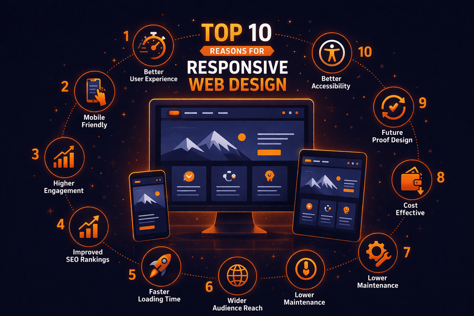
Responsive web design means a site that adapts its layout to any screen, so it looks and works right whether someone opens it on a phone, a tablet, or a desktop. It stopped being a nice-to-have years ago. Here are the top 10 reasons it is essential today.
1. Most of Your Visitors Are on Mobile
More than half of all web traffic now comes from phones. A responsive site meets people on the device they actually use, rather than forcing a cramped desktop layout onto a small screen. Ignore mobile and you are turning away the majority of your audience before they see a thing.

2. A Better Experience on Every Device
Responsive design gives everyone one clean, consistent experience across phone, tablet, and desktop. No pinching, no zooming, no sideways scrolling to read a sentence. When a site is genuinely easy to use, people stay longer, read more, and come back.

3. Higher Search Engine Rankings
Google indexes the mobile version of your site first and rewards pages that work well on phones. A single responsive site sends clean signals to search engines and avoids the duplicate-content problems that separate mobile sites often create. Better mobile usability tends to mean better rankings.

4. Lower Cost and Easier Maintenance
One responsive site replaces the old approach of building and running a separate mobile version. That means one codebase, one set of content, and one thing to update. Over the life of a site, that saves a real amount of time and money.

5. Faster Load Times
A well-built responsive site serves the right assets for each device, which keeps pages quick. Speed stops visitors from bouncing and is itself a ranking factor, so a fast, responsive site helps you on two fronts at the same time.

6. Higher Conversion Rates
A smooth, consistent experience removes the friction that makes people abandon a purchase or a form. When the path to buying or signing up is just as easy on a phone as on a desktop, more visitors actually follow it to the end.

7. Wider Reach Across Devices
Screens keep multiplying, from phones and tablets to laptops, foldables, and large monitors. Responsive design adapts to whatever size shows up, so you reach the widest possible audience without building something new for each new device.

8. Simpler Content Management
With one site to manage, you update content in a single place and it shows up correctly everywhere. There is no syncing changes between a desktop and a mobile version, and far less chance of the two drifting out of step.

9. Future-Proof and Adaptable
New devices and screen sizes appear constantly. A fluid, responsive layout bends to fit them instead of breaking, so your site keeps working on hardware that did not even exist when you first built it.

10. Stronger Brand Credibility
A site that looks polished and works flawlessly on every device tells visitors you are professional and worth trusting. A broken or clunky mobile experience says the opposite. Consistency across screens protects and strengthens your brand.

Final Thoughts
Responsive design is not a trend, it is the baseline for a modern website. It shapes how people experience your site, how search engines rank it, and how much it costs you to run. If your site does not adapt smoothly to every screen, these ten reasons are ten good arguments to fix that. At Maxsoft, that is the standard we build to.